Mythic Palace
BIG project with big non-disclosure agreement
26/07/11
I’m in the process of completing almost 75 paintings for an awesome project that will be unveiled sometime this year. I think I have been doing my best work on this assignment and I can’t wait to show everyone what I have been working on.
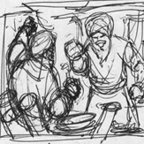 Until then, here is the genesis of Trade War. This was done a few years back for a game called Mythic Palace from Breakaway Games.
I received this thumbnail sketch from the Art Director. When I receive a thumbnail sketch, I always ask myself “What is it trying to say?”
These small (credit card size or so) tonal and compositional sketches are used to try out design or subject ideas. As always with thumbnails, it’s hard to translate the energy and emotion in a thumbnail into a finished image. In a thumbnail, you go for the broad gesture with tacit regard to anatomy. Some artists use this phase to graphically design the piece. They can spot blacks, cast shadows, even add in little background details. This one was pretty good. It was loose enough for me to see the action without tying me down with too much detail.
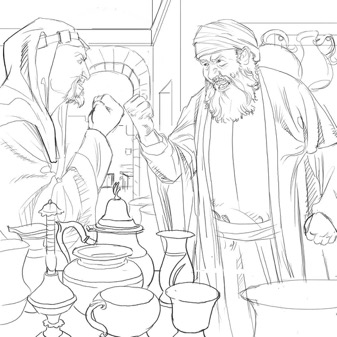
Here is what I came up with.
I kept the broad placement of the figures and changed the pose of the figure on the left. The pose was a bit to cartoony for my realistic art style. Even though I think I sacrificed some of the energy in the thumbnail because of that decision, I think I made the right call.
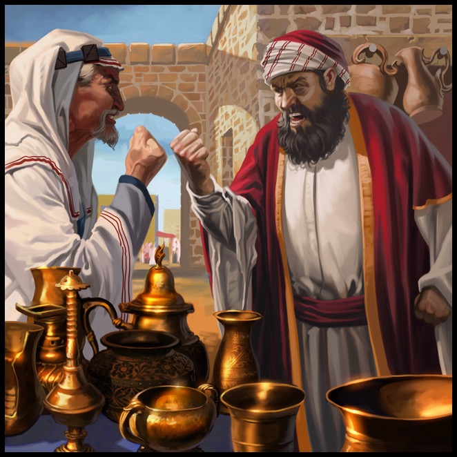
The finish was done in Corel Painter.
I have a couple more Mythic Palace paintings. I’ll post them over the next few days.

I received this thumbnail sketch from the Art Director. When I receive a thumbnail sketch, I always ask myself “What is it trying to say?”
These small (credit card size or so) tonal and compositional sketches are used to try out design or subject ideas. As always with thumbnails, it’s hard to translate the energy and emotion in a thumbnail into a finished image. In a thumbnail, you go for the broad gesture with tacit regard to anatomy. Some artists use this phase to graphically design the piece. They can spot blacks, cast shadows, even add in little background details. This one was pretty good. It was loose enough for me to see the action without tying me down with too much detail.

Here is what I came up with.
I kept the broad placement of the figures and changed the pose of the figure on the left. The pose was a bit to cartoony for my realistic art style. Even though I think I sacrificed some of the energy in the thumbnail because of that decision, I think I made the right call.

The finish was done in Corel Painter.
I have a couple more Mythic Palace paintings. I’ll post them over the next few days.